Snavade just över denna förträffliga artikel som analyserar, och teoretiserar kring, olika sätt att designa en dungeon.
You are using an out of date browser. It may not display this or other websites correctly.
You should upgrade or use an alternative browser.
You should upgrade or use an alternative browser.
Nekromanti En analys av dungeondesign
- Thread starter Dante
- Start date
chrull
Stockholm Kartell
- Joined
- 17 May 2000
- Messages
- 8,922
Vitulv said:Åh, kan inte du formge den så att den går att läsa?
+1
En analys av dungeondesign (läsbar)
[This is a discussion of dungeon mapping by the Dragonsfoot/ENWorld poster «Melan». It was originally posted to ENWorld as «Dungeon layout, map flow and old school game design», then to a Dragonsfoot Forums thread entitled «Megadungeon Mapping».]
Dungeon Mapping
In my opinion, designing a good dungeon also involves creating a good map. It must be stressed that this is obviously only half the battle – without imaginative content, all the effort is for naught; while a dungeon whose map is poorly designed may be saved by well thought out encounters. In this thread, I don’t wish to discuss the latter aspect, only mapping and how it can contribute to enjoyable play. What makes a map good or bad? Fundamentally, a good map should enhance the factors which make dungeon crawling enthralling: for instance, exploration, player decision making, uncovering hidden areas and secrets, as well as maintaining the pace of action.
Exploration entails discovering previously unknown territory. To find a lower level, a section the PCs have never been to, or simply some entertaining and imaginative room, is one of the great joys of dungeoneering. However, for all this to feel like an accomplishment, there has to be a meaningful effort on the part of the players and a challenge on part of the DM. There can be no real exploration if the dungeon isn’t large enough or complex enough to allow failure, as in certain areas being missed. If encounters are presented one after another, there is no challenge and no accomplishment in this respect.
Player decision making from the operative to the tactical and strategic level involves dealing with obstacles, negotiating hostile territory and ensuring the success of an entire expedition. Naturally, many individual decisions are based on a «golden rule» such as left-hand-on-the-wall or random chance, especially when there is no way of knowing what the decision «means»; that is, what its likely outcome in one case or the other may be. However, by making a dungeon where the players can choose to avoid or meet obstacles, take or avoid risks by visiting/not visiting «deeper levels», explore side branches or concentrate on reaching an objective, etc., player decision making becomes a more interesting and meaningful challenge. Generally, branching, complex maps offer many possibilities for decision making, but overly complicated maps do not: they just cause frustration.
Uncovering hidden areas or secrets is yet another form of reward for resourceful players. Finding a secret door leading to a room with treasure is fun; finding one leading to a hidden sublevel or a previously undiscovered section is even better. A good dungeon should have at least a few of these, preferably a good amount, and they should be found primarily due to player ingenuity. Judges Guild’s Caverns of Thracia is likely the best example of a dungeon with well designed secrets: entire levels and sub-levels may be uncovered by observation and resourcefulness.
Finally, maintaining the pace of action is important to ensure the game remains exciting and doesn’t get bogged down for too long. Shoot-and-kill computer games usually call this «map flow».
Turning back to my original point, how do Sunless Citadel and Forge of Fury stack up to other introductory modules in the maps department? Do they represent design which encourages and rewards exploration, which presents mysteries and which doesn’t constrain players with a pre-written script? In my opinion, they do not. There are hints of good game design in there, but not enough to call the modules better than average (I could list other reasons as well, but that is outside the present subject). Both of these modules miss «something» many classics have, something which is closely linked with avoiding railroading – constructing a map which isn’t a straight line, but rather one which has side-tracks, circular routes, opportunities to approach a given location from multiple directions, opportunities to demonstrate one’s mapping skills (without it getting tedious) and maybe more. Citadel and Forge are disturbingly linear, and are no less railroady than your usual 2e module. (To preclude derailing the thread, I freely admit that many 1st edition modules are just as guilty of the same sin, especially those designed for tournament play.)
To compare the WotC introductory modules with various other introductory products from the 70s and 80s, I used a graphical method which «distils» a dungeon into a kind of decision tree or flowchart by stripping away «noise». On the resulting image, meandering corridors and even smaller room complexes are turned into straight lines. Although the image doesn’t create an «accurate» representation of the dungeon map, and is by no means a «scientific» depiction, it demonstrates what kind of decisions the players can make while moving through the dungeon. Briefly going over basic forms, a dungeon may look like any of the following, or be made up of several such basic elements:
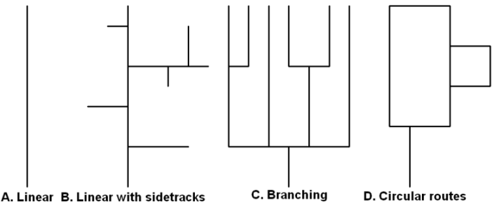
In the end, a dungeon without any real branches would look like a straight line (A.), or a straight line that looks slightly hairy (B.). The Slaver modules or Lost Tomb of Martek would fall into this category. Branching dungeons (C.) are a bundle of straight lines (often with sidetracks), sometimes resembling trees. White Plume Mountain is a good example of a branching dungeon. Finally, dungeons with circular routes (D.) are the most complex, especially when these routes interlock and include the third dimension. Again, Paul Jaquays is the undisputed master of this area, with modules like Caverns of Thracia, Dark Tower and Realm of the Slime God. In my opinion, including the second two forms without being overwhelming makes a dungeon map much better than a straight affair.
Let us now look at the modules. I selected six modules aimed at beginners for my analysis and supplemented them with two for high levels (these were included for comparative purposes also). Of the eight, four modules were written by Gary Gygax, which could have skewed the sample a bit. Then again, the aim wasn’t strict «science», just a fun comparison. On these maps, dashed lines represent secret passages/connections and broken lines represent «level transitions».
Sunless Citadel
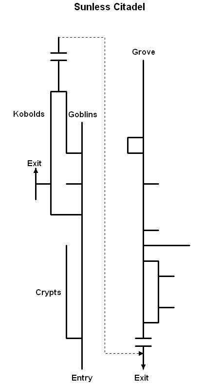
Sunless Citadel’s layout is the perfect example of an almost completely linear dungeon. This isn’t apparent on first sight, because Bruce Cordell introduced a lot of twists to the corridors so they would look more organic, but in the end, it is still a straight line with the «choice» of either going through the kobolds or goblins, woo hoo. Sunless Citadel is, all claims to the contrary, not a classic dungeon: it is designed to be a story, and it plays like a story. Unfortunately, player choice isn’t high in it outside combat tactics… which, granted, are fun. But a good map it is not.
Forge of Fury
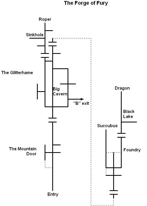
Our second module (author Richard Baker) is more promising on first sight, but eventually reveals the same structure: straight line layout, definite beginning and definite end in the form of a boss monster. Little player choice. The only thing that makes Forge’s maps better designed is the presence of optional detours. It is interesting to see the thought process behind them: the big detours lead to «mini-bosses», a roper and a succubus, respectively.
Keep on the Borderlands
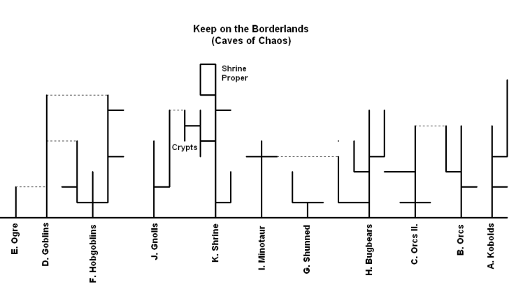
Let us compare the previous modules with the classic Keep on the Borderlands by Gary Gygax. I will omit the keep and wilderness (which introduce some really entertaining possibilities, greatly enhancing the game experience – these elements are regrettably absent in Forge and Sunless) and focus on the Caves of Chaos instead. The layout of this dungeon area is completely different from the aforementioned. The individual monster lairs follow the «straight line» or «branching» structure, but the number of these lairs and the occasional secret connection make adventuring in this environment rewarding indeed. All of the lairs may be entered at will (the long horizontal line on the image represents the ravine). The dungeon is thus both complex and compartmental – with enough room for exploration, but probably not overwhelming if the lairs are tackled individually.
In Search of the Unknown
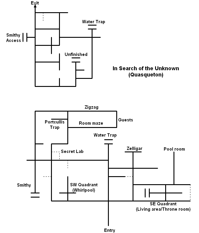
Mike Carr’s In Search of the Unknown has the most complex dungeon layout in our sample. I would argue that the main draw of the module is precisely this – it presents a lot of classic dungeon exploration challenges like room mazes, secret doors, twisting corridors and such. What makes it even better in my opinion is that it does this without being frustrating, but also because the macrostructure beyond the basic elements is so good. You can explore this dungeon and really find things. Unfortunately, the entire dungeon couldn’t be represented as a single network (the lower level would have made it very convoluted for the observer), but I hope my point was made. B1 harkens back to Original D&D design principles and it shows.
The Village of Hommlet
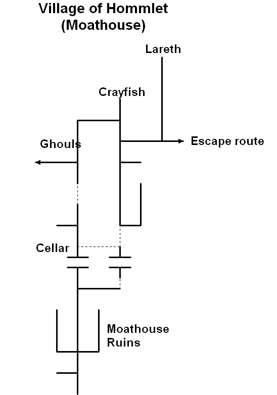
I freely admit that I dislike this module, and my analysis may be coloured by bias. However, looking at the layout of this dungeon, one of my complaints about it is reaffirmed – this is an early example of the linear adventure. You can even identify the boss monster (and the crayfish miniboss, of course, who is cooler than the boss himself). The moathouse dungeon has two redeeming features (not enough to be cool in my eyes, though): one, hiding the entire «inner dungeon» by two secret doors is a good idea – it forces the players to be alert and attentive, even resourceful. Second, it is a very small dungeon, where it is hard to really shine in mapping. Granted, this is because Gygax wasted too much space on Lameburg and its entirely mundane and boring residents, but hey.
Palace of the Silver Princess
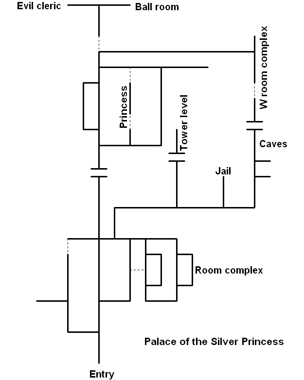
Palace of the Silver Princess is not usually considered a good module, but I actually think it is better than its reputation (the orange one, at least): a straightforward dungeon bash with a lot of unexplained stuff (a good point), a lot of magic and secret to boot. It also has a very good map. I really like the multiple nested circular routes on the lower level, and also the fact that the module has two «conclusions» – one of them is finding and killing the evil cleric, and the other is finding the hidden room of the princess and her lover (who are accursed ghosts – a nice twist on the cheesy «save the princess» cliché). However, most parties would only find the former! That’s great. I wish more modules had that secrets within secrets and mysteries within mysteries element.
Glacial Rift of the Frost Giant Jarl
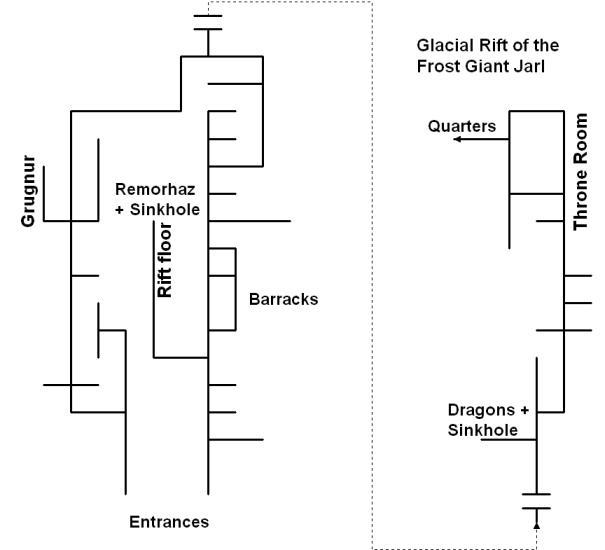
This module wasn’t an introductory product like the others, but it was among the first modules TSR published. I included it because of its tournament design: it has some flaws similar to Sunless Citadel and Forge of Fury, in that it is once again too restrictive in some respects… on the other hand, there are so many well designed side areas, especially on the higher level, that this isn’t so bothersome in play. G2 (and Tomb of Horrors, which I didn’t have at hand) demonstrate that the linear structure can work – if balanced by good content (conversely, In Search of the Unknown is only «good» instead of «great» because most rooms just aren’t that great).
Descent into the Depths of the Earth
I will not discuss the underworld section of this module, because it falls into the domain of wilderness adventuring, and will instead focus on the set-piece: the troglodyte/drow warren. Similar to Keep on the Borderlands, this dungeon is greatly helped by an open central area from which «branches» can be accessed. The great cavern links individual monster lairs, some of which are nasty and some of which are very, very nasty. As we can see, the western half has more individual lairs (usually with more dangerous denizens), the eastern half is more «mazy», and here the challenge is in overwhelming numbers and using the terrain layout to advantage.
I hope that these brief demonstrations helped underscore the gist of my argument: good map design contributes to the fun of an adventure, and it is not a total crapshoot – there are clearly identifiable design principles which (admittedly from a gamist/«old school»standpoint), when followed, benefit a given creation. Sunless Citadel and Forge of Fury aren’t flawed adventures because they are new, but because they employ a structure which is antithetical to freeform play and represents a more rigid «story-game» approach, something D&D should be rid of. Likewise, many (although not all) old adventures are good because they do these things right, not because of the tired and fallacious «rose coloured glasses» argument. There is nothing preventing modern designers (or just garden variety DMs) from learning these tricks and using them towards their own ends.
It also has to be reiterated (because it needs repeating) that maps aren’t all. They can’t make a module good solely on their own. But I think we can accept that they can help a module be better, and that goal should not be underestimated.
That is all.
[Originalartikeln återfinns som sagt här.]
[This is a discussion of dungeon mapping by the Dragonsfoot/ENWorld poster «Melan». It was originally posted to ENWorld as «Dungeon layout, map flow and old school game design», then to a Dragonsfoot Forums thread entitled «Megadungeon Mapping».]
Dungeon Mapping
In my opinion, designing a good dungeon also involves creating a good map. It must be stressed that this is obviously only half the battle – without imaginative content, all the effort is for naught; while a dungeon whose map is poorly designed may be saved by well thought out encounters. In this thread, I don’t wish to discuss the latter aspect, only mapping and how it can contribute to enjoyable play. What makes a map good or bad? Fundamentally, a good map should enhance the factors which make dungeon crawling enthralling: for instance, exploration, player decision making, uncovering hidden areas and secrets, as well as maintaining the pace of action.
Exploration entails discovering previously unknown territory. To find a lower level, a section the PCs have never been to, or simply some entertaining and imaginative room, is one of the great joys of dungeoneering. However, for all this to feel like an accomplishment, there has to be a meaningful effort on the part of the players and a challenge on part of the DM. There can be no real exploration if the dungeon isn’t large enough or complex enough to allow failure, as in certain areas being missed. If encounters are presented one after another, there is no challenge and no accomplishment in this respect.
Player decision making from the operative to the tactical and strategic level involves dealing with obstacles, negotiating hostile territory and ensuring the success of an entire expedition. Naturally, many individual decisions are based on a «golden rule» such as left-hand-on-the-wall or random chance, especially when there is no way of knowing what the decision «means»; that is, what its likely outcome in one case or the other may be. However, by making a dungeon where the players can choose to avoid or meet obstacles, take or avoid risks by visiting/not visiting «deeper levels», explore side branches or concentrate on reaching an objective, etc., player decision making becomes a more interesting and meaningful challenge. Generally, branching, complex maps offer many possibilities for decision making, but overly complicated maps do not: they just cause frustration.
Uncovering hidden areas or secrets is yet another form of reward for resourceful players. Finding a secret door leading to a room with treasure is fun; finding one leading to a hidden sublevel or a previously undiscovered section is even better. A good dungeon should have at least a few of these, preferably a good amount, and they should be found primarily due to player ingenuity. Judges Guild’s Caverns of Thracia is likely the best example of a dungeon with well designed secrets: entire levels and sub-levels may be uncovered by observation and resourcefulness.
Finally, maintaining the pace of action is important to ensure the game remains exciting and doesn’t get bogged down for too long. Shoot-and-kill computer games usually call this «map flow».
Turning back to my original point, how do Sunless Citadel and Forge of Fury stack up to other introductory modules in the maps department? Do they represent design which encourages and rewards exploration, which presents mysteries and which doesn’t constrain players with a pre-written script? In my opinion, they do not. There are hints of good game design in there, but not enough to call the modules better than average (I could list other reasons as well, but that is outside the present subject). Both of these modules miss «something» many classics have, something which is closely linked with avoiding railroading – constructing a map which isn’t a straight line, but rather one which has side-tracks, circular routes, opportunities to approach a given location from multiple directions, opportunities to demonstrate one’s mapping skills (without it getting tedious) and maybe more. Citadel and Forge are disturbingly linear, and are no less railroady than your usual 2e module. (To preclude derailing the thread, I freely admit that many 1st edition modules are just as guilty of the same sin, especially those designed for tournament play.)
To compare the WotC introductory modules with various other introductory products from the 70s and 80s, I used a graphical method which «distils» a dungeon into a kind of decision tree or flowchart by stripping away «noise». On the resulting image, meandering corridors and even smaller room complexes are turned into straight lines. Although the image doesn’t create an «accurate» representation of the dungeon map, and is by no means a «scientific» depiction, it demonstrates what kind of decisions the players can make while moving through the dungeon. Briefly going over basic forms, a dungeon may look like any of the following, or be made up of several such basic elements:

In the end, a dungeon without any real branches would look like a straight line (A.), or a straight line that looks slightly hairy (B.). The Slaver modules or Lost Tomb of Martek would fall into this category. Branching dungeons (C.) are a bundle of straight lines (often with sidetracks), sometimes resembling trees. White Plume Mountain is a good example of a branching dungeon. Finally, dungeons with circular routes (D.) are the most complex, especially when these routes interlock and include the third dimension. Again, Paul Jaquays is the undisputed master of this area, with modules like Caverns of Thracia, Dark Tower and Realm of the Slime God. In my opinion, including the second two forms without being overwhelming makes a dungeon map much better than a straight affair.
Let us now look at the modules. I selected six modules aimed at beginners for my analysis and supplemented them with two for high levels (these were included for comparative purposes also). Of the eight, four modules were written by Gary Gygax, which could have skewed the sample a bit. Then again, the aim wasn’t strict «science», just a fun comparison. On these maps, dashed lines represent secret passages/connections and broken lines represent «level transitions».
Sunless Citadel

Sunless Citadel’s layout is the perfect example of an almost completely linear dungeon. This isn’t apparent on first sight, because Bruce Cordell introduced a lot of twists to the corridors so they would look more organic, but in the end, it is still a straight line with the «choice» of either going through the kobolds or goblins, woo hoo. Sunless Citadel is, all claims to the contrary, not a classic dungeon: it is designed to be a story, and it plays like a story. Unfortunately, player choice isn’t high in it outside combat tactics… which, granted, are fun. But a good map it is not.
Forge of Fury

Our second module (author Richard Baker) is more promising on first sight, but eventually reveals the same structure: straight line layout, definite beginning and definite end in the form of a boss monster. Little player choice. The only thing that makes Forge’s maps better designed is the presence of optional detours. It is interesting to see the thought process behind them: the big detours lead to «mini-bosses», a roper and a succubus, respectively.
Keep on the Borderlands

Let us compare the previous modules with the classic Keep on the Borderlands by Gary Gygax. I will omit the keep and wilderness (which introduce some really entertaining possibilities, greatly enhancing the game experience – these elements are regrettably absent in Forge and Sunless) and focus on the Caves of Chaos instead. The layout of this dungeon area is completely different from the aforementioned. The individual monster lairs follow the «straight line» or «branching» structure, but the number of these lairs and the occasional secret connection make adventuring in this environment rewarding indeed. All of the lairs may be entered at will (the long horizontal line on the image represents the ravine). The dungeon is thus both complex and compartmental – with enough room for exploration, but probably not overwhelming if the lairs are tackled individually.
In Search of the Unknown

Mike Carr’s In Search of the Unknown has the most complex dungeon layout in our sample. I would argue that the main draw of the module is precisely this – it presents a lot of classic dungeon exploration challenges like room mazes, secret doors, twisting corridors and such. What makes it even better in my opinion is that it does this without being frustrating, but also because the macrostructure beyond the basic elements is so good. You can explore this dungeon and really find things. Unfortunately, the entire dungeon couldn’t be represented as a single network (the lower level would have made it very convoluted for the observer), but I hope my point was made. B1 harkens back to Original D&D design principles and it shows.
The Village of Hommlet

I freely admit that I dislike this module, and my analysis may be coloured by bias. However, looking at the layout of this dungeon, one of my complaints about it is reaffirmed – this is an early example of the linear adventure. You can even identify the boss monster (and the crayfish miniboss, of course, who is cooler than the boss himself). The moathouse dungeon has two redeeming features (not enough to be cool in my eyes, though): one, hiding the entire «inner dungeon» by two secret doors is a good idea – it forces the players to be alert and attentive, even resourceful. Second, it is a very small dungeon, where it is hard to really shine in mapping. Granted, this is because Gygax wasted too much space on Lameburg and its entirely mundane and boring residents, but hey.
Palace of the Silver Princess

Palace of the Silver Princess is not usually considered a good module, but I actually think it is better than its reputation (the orange one, at least): a straightforward dungeon bash with a lot of unexplained stuff (a good point), a lot of magic and secret to boot. It also has a very good map. I really like the multiple nested circular routes on the lower level, and also the fact that the module has two «conclusions» – one of them is finding and killing the evil cleric, and the other is finding the hidden room of the princess and her lover (who are accursed ghosts – a nice twist on the cheesy «save the princess» cliché). However, most parties would only find the former! That’s great. I wish more modules had that secrets within secrets and mysteries within mysteries element.
Glacial Rift of the Frost Giant Jarl

This module wasn’t an introductory product like the others, but it was among the first modules TSR published. I included it because of its tournament design: it has some flaws similar to Sunless Citadel and Forge of Fury, in that it is once again too restrictive in some respects… on the other hand, there are so many well designed side areas, especially on the higher level, that this isn’t so bothersome in play. G2 (and Tomb of Horrors, which I didn’t have at hand) demonstrate that the linear structure can work – if balanced by good content (conversely, In Search of the Unknown is only «good» instead of «great» because most rooms just aren’t that great).
Descent into the Depths of the Earth

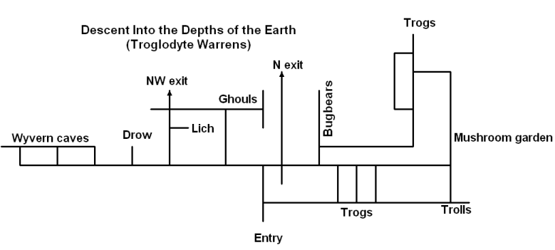
I will not discuss the underworld section of this module, because it falls into the domain of wilderness adventuring, and will instead focus on the set-piece: the troglodyte/drow warren. Similar to Keep on the Borderlands, this dungeon is greatly helped by an open central area from which «branches» can be accessed. The great cavern links individual monster lairs, some of which are nasty and some of which are very, very nasty. As we can see, the western half has more individual lairs (usually with more dangerous denizens), the eastern half is more «mazy», and here the challenge is in overwhelming numbers and using the terrain layout to advantage.
I hope that these brief demonstrations helped underscore the gist of my argument: good map design contributes to the fun of an adventure, and it is not a total crapshoot – there are clearly identifiable design principles which (admittedly from a gamist/«old school»standpoint), when followed, benefit a given creation. Sunless Citadel and Forge of Fury aren’t flawed adventures because they are new, but because they employ a structure which is antithetical to freeform play and represents a more rigid «story-game» approach, something D&D should be rid of. Likewise, many (although not all) old adventures are good because they do these things right, not because of the tired and fallacious «rose coloured glasses» argument. There is nothing preventing modern designers (or just garden variety DMs) from learning these tricks and using them towards their own ends.
It also has to be reiterated (because it needs repeating) that maps aren’t all. They can’t make a module good solely on their own. But I think we can accept that they can help a module be better, and that goal should not be underestimated.
That is all.
[Originalartikeln återfinns som sagt här.]
Re: En analys av dungeondesign (läsbar)
Fan va cool artikel!
/Magnus
Fan va cool artikel!
/Magnus
Det här är något jag vill utforska mer i framtiden. Särskilt fascinerad är jag av minidungen "The House of Rogat Demazien" (återfinns helt gratis här ), som är ett utmärkt exempel på en helt öppen design. Till den dungen finns i praktiken 3-4 startpunkter beroende på hur man räknar, ingen "end boss" och något särskilt rum man måste nå, och definitivt ingen som helst påtvingad ordning.
Den öppna lösningen och den totala avsaknaden av "förväntad" utgång av saker och ting är oerhört uppfriskande tycker jag, och gör mig som referee mycket mer avslappnad. Det finns något mycket behagligt i att spelarna inte kan "förstöra" något oavsett vad de tar sig till, eller att någon viss sorts spells "förstör" någon del av spelmötet.
Den öppna lösningen och den totala avsaknaden av "förväntad" utgång av saker och ting är oerhört uppfriskande tycker jag, och gör mig som referee mycket mer avslappnad. Det finns något mycket behagligt i att spelarna inte kan "förstöra" något oavsett vad de tar sig till, eller att någon viss sorts spells "förstör" någon del av spelmötet.
Tyr
Hero
Re: En analys av dungeondesign (läsbar)
Åh vad jag saknar dungeon-byggande. Artikeln fick mig nästan till att börja skissa på en.
Åh vad jag saknar dungeon-byggande. Artikeln fick mig nästan till att börja skissa på en.

CapnZapp
Myrmidon
- Joined
- 3 Apr 2008
- Messages
- 4,037
Fräckt analysverktyg.
Men inte krävs det så mycket arbete för att kunna konstatera att sämre äventyrskonstruktion än vad WotC generellt kräkt ur sig går knappast att hitta.
Det finns några få guldkorn men inte är de många.
Ett av de värsta mardrömsmisslyckandena är 4E-modulen "Revenge of the Giants". Den är så sopig att man får krupp...
Jag tror inte det var poängen.CapnZapp said:Men inte krävs det så mycket arbete för att kunna konstatera att sämre äventyrskonstruktion än vad WotC generellt kräkt ur sig går knappast att hitta.
Men låt inte mig hindra dig från att hata.
Fiktionslek
Suldokar's Wake Whitehack Oktoberlandet
- Joined
- 23 Aug 2006
- Messages
- 1,422
På sätt och vis är det ju ganska självklara grejer som presenteras, för man vet redan att linjära dungeons är trista. Men verktygen för analys är smidiga, och man får liksom en checklista att bocka av. Framför allt känner jag att artikeln är ett tungt argument för att ordentligt förberedda äventyr har sina poänger – uppfriskande efter allt tal om pickup-spel och improvisationsspel.
Tycker
Christian
Tycker
Christian
CapnZapp
Myrmidon
- Joined
- 3 Apr 2008
- Messages
- 4,037
Personligen tror jag att det stora steget man tar som rollspelskonstruktör, det är när man tar steget upp från dungeonen och börjar designa äventyr ute i den fria världen, och ännu mer om man *hemska tanke* börjar designa sina äventyr kring idéer, berättelser, känslor och personer och inte rum, korridorer och platser.
Med andra ord; ju längre man snöar in på dungeonanalys, desto mer missar man målet.
Med andra ord; ju längre man snöar in på dungeonanalys, desto mer missar man målet.
Fiktionslek
Suldokar's Wake Whitehack Oktoberlandet
- Joined
- 23 Aug 2006
- Messages
- 1,422
Det står ju var och en fritt att spela t.ex. Sorcerer eller något av dess derivat. Men vad har det med dungeondesign att göra? Intressantare vore väl i det *här* sammanhanget (d.v.s. trådämnet) att stanna i sin dungeon och ändå få in idéer, berättelser, personer och känslor. Går det att göra snyggt?
Undrar
Christian
Undrar
Christian
anth
Vetefan
Betyder detta att du tycker att nästa version av av DnD - det som i filkmun brukar kallas DnD5, men som inte fått något namn ännu av Wizards - borde heta "Dragons in the Wild"?CapnZapp said:Personligen tror jag att det stora steget man tar som rollspelskonstruktör, det är när man tar steget upp från dungeonen och börjar designa äventyr ute i den fria världen, och ännu mer om man *hemska tanke* börjar designa sina äventyr kring idéer, berättelser, känslor och personer och inte rum, korridorer och platser.
Med andra ord; ju längre man snöar in på dungeonanalys, desto mer missar man målet.
Inte om man är ute efter att designa dungeons.CapnZapp said:Med andra ord; ju längre man snöar in på dungeonanalys, desto mer missar man målet.
Det finns flera sätt att introducera idéer, berättelser, personer och känslor i dungeons. Huruvida man tycker att detta är en bra sak eller inte är individuellt. Några exempel:
Idéer - Hammers of the God
I denna moderna klassiker presenteras via runskrifter, böcker och målningar delar som av den uppmärksamme kan vävas ihop till en tanke om hur ett dominant imperium kan falla på eget grepp och om vad den skammen kan innebära.
Känslor - Ravenloft
I denna legendariska modul handlade allting i grund och botten om kärlek, svek, hämnd och förtvivlan; sakta upprullat genom målningar, dagböcker och möten med andar från andra sidan.
Berättelser - Dragonlance
En riktig vattendelare och en lång, lång kampanj, där moduler och romaner skrevs sida vid sida. Berättelsen presenteras via tvingade händelseförlopp, där spelarna fick vara med och återuppleva romanernas händelser själva.
Fiktionslek
Suldokar's Wake Whitehack Oktoberlandet
- Joined
- 23 Aug 2006
- Messages
- 1,422
Coolt! Dragonlance har jag läst. Men Ravenloft har jag bara spelat i form av det där nya brädspelet och Hammers of the God har jag inte spelat alls. Jag gillar dock Lamentations... så jag kanske borde skaffa både Ravenloft och Hammers.
Tack för tipsen!
Christian
Tack för tipsen!
Christian
